Melbourne Design Awards: Craig and Rose wins Gold
09.12.19 - Julian Marocchini
Project Overview
The overarching theme and design mission ..
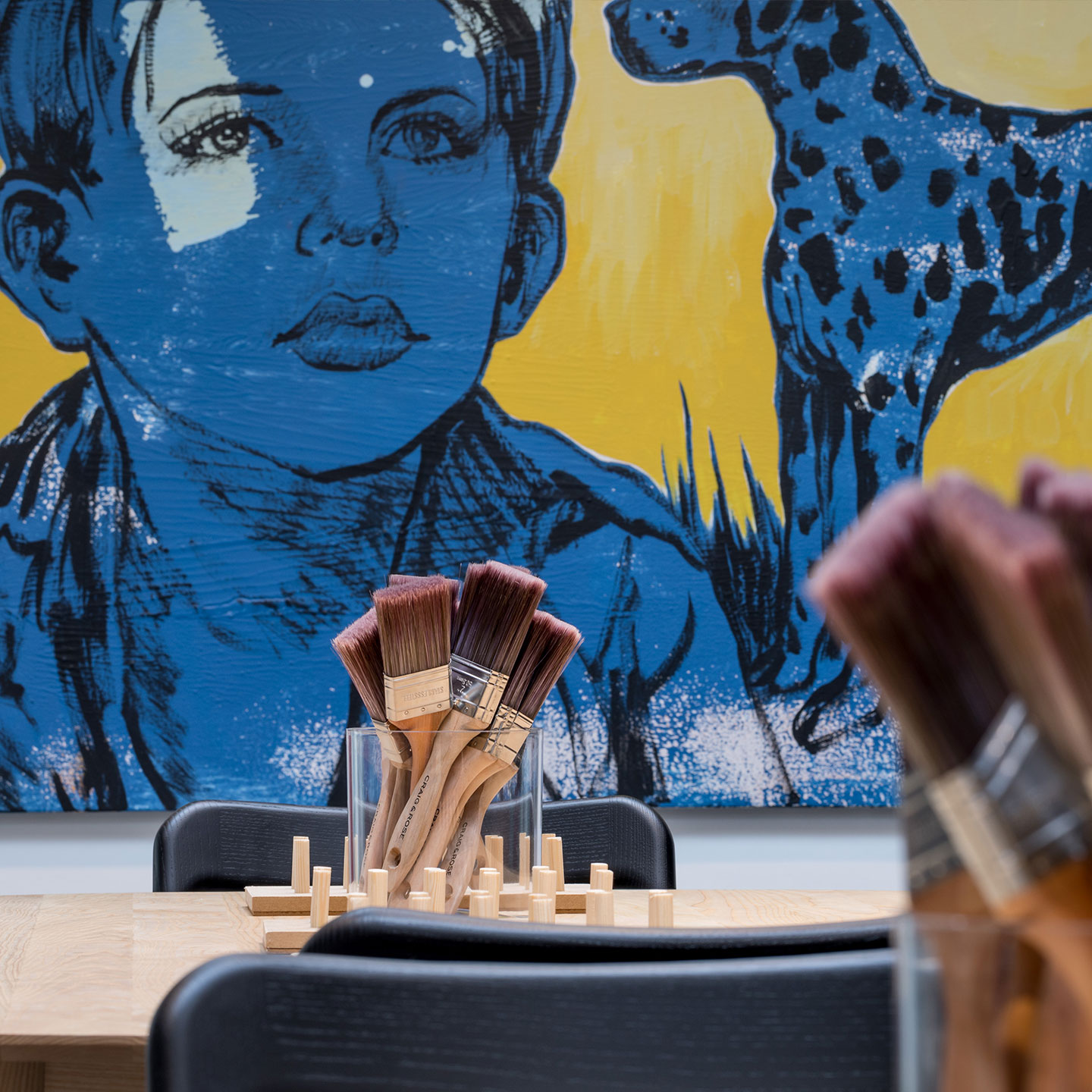
Is to create not just a paint store, but a creative studio space.
A space where customers feel inspired and welcomed to test and sample paint, colour and speciality finishes.
A space to educate the consumer and introduce them to colours and effects they may not otherwise have considered. Endless possibilities and colour choices, no restrictions!
Project Brief
To develop the Craig & Rose brand into a credible competitor within the premium paint category in the UK.
We believe the UK consumer deserves better. It all started with Craig & Rose in 1829 and their mix of art and science. The Craig & Rose history allows us to create a new way to achieve the look you want. That you can have a premium quality paint, superior finishes and depth of colour at the price that might surprise you.
We will inspire our consumers to imagine what might be, to bring their project to life.
We will help our consumers create a look that reflects their personal style, as unique, interesting and independent as they are.
From inspiration to purchase, where, when and how you want. We’ll guide you every step of the way.
Project Innvoation/Need
A curated colour offer;
A consultative customer service approach,
Service led colour selection process,
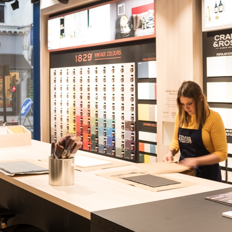
Consumers experience the product and experiment live in store,
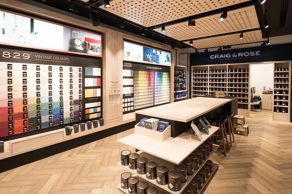
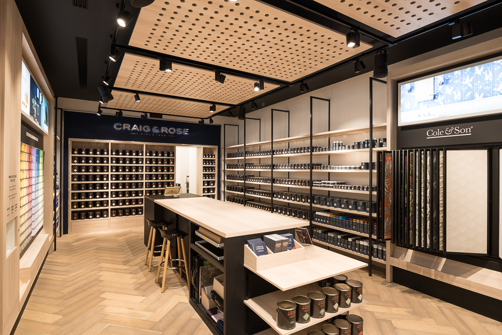
Consumers are educated on the effects of light on paint and colour, through dedicated light boxes integrated in the colour walls.
A space for workshops and seminars.
Design Challenge
Developing the new brand;
DISRUPTIVELY DIFFERENT
Craig & Rose® champions creative ambition, helping you make bolder, more adventurous, creative choices. Fearlessly creative since 1829.
The creative within, with one’s own sense of self, style, imagination and dreams.
“I’m comfortable being me, and in the grand scheme of things, I know that I am different and sometimes a little afraid to be bold and adventurous – which suits me just fine. My head and heart are always open to the experiences the world may offer, I just need to be motivated”
That journey begins with Craig & Rose, and together with the understanding that it is
better to “not go where the path may lead, go instead where there is no path and
leave a trail” gives me the motivation, belief and ambition to be creative, different but retain the charm and refined nature that is me.
I never rule anything out and this, my friends might say, condemns me, in the most
exquisite way, to live an almost idiosyncratic life. There is no such thing as “too much” in my world. Now for some people that might be difficult to embrace or even a little scary to consider…but I’m one of the quirky ones, breaking the rules, being disruptive and going where you are not supposed to, doing things you wouldn’t typically do. Join my journey and let’s champion our creative ambition’s, let’s be bold, let’s be adventurous, let’s be fearless!
User Experience
With three key ingredients to each store;
1. Colour Inspiration – Highly visual, flexible and constantly changing.
2. Colour Selection – Promotes interaction, conversation & education about colour.
3. Colour Creation – An activated space for tinting and brush out preparation.
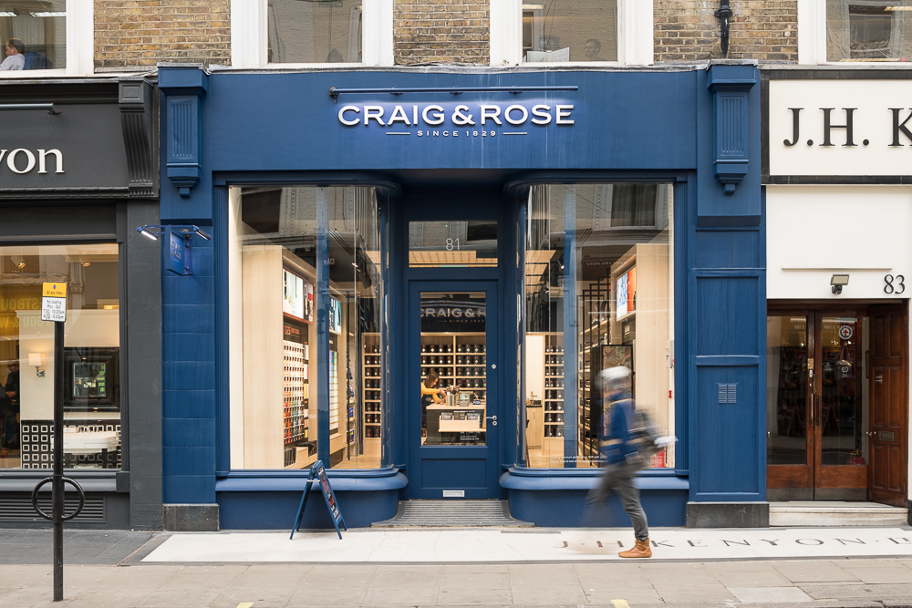
Open and activated shopfronts inviting consumers into a world of colour and inspiration. Highly visual with an uninterrupted view into the studio/gallery.
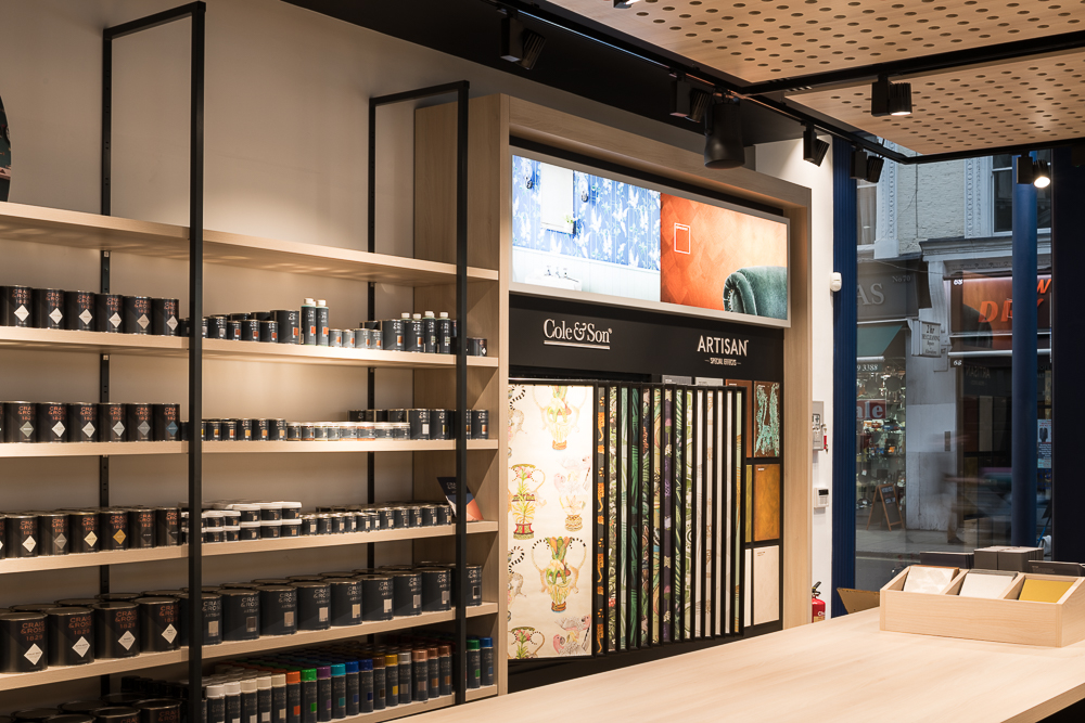
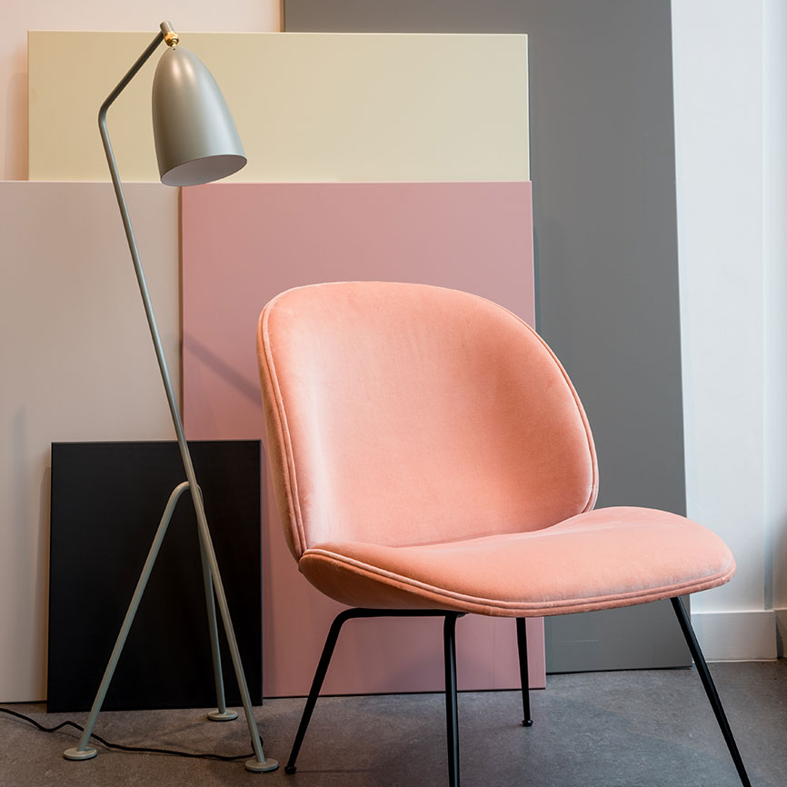
The material & finishes selected for the space present a contemporary, neutral and natural colour palette, plywood finishes & large pegboard patterns promote a creative design studio environment. A simple and minimal choice in finishes with white, black and plywood being the main three ensuring the product stands out and takes the spotlight. The colour palette and design are intentionally left neutral to ensure the space can cater for all customers and does not represent any one particular style, home type etc
Big and bold colour walls designed to be different and uniquely Craig & Rose.
A large presence in the space with neutral contrasting colours to ensure the focus remains on paint colour swatches and chips.
Large colour panels with sample pots located together with the colour panels to promote sample pot purchases.
Built in light boxes to demonstrate colour in various lighting conditions aimed to educating the consumer on colour and light and providing the consumer with more information to narrow the selection process.
Concept design by E2. Credits: Local project development by 101 Architecture+Design UK. Photography by Ben Pipe and Andy Tyler.